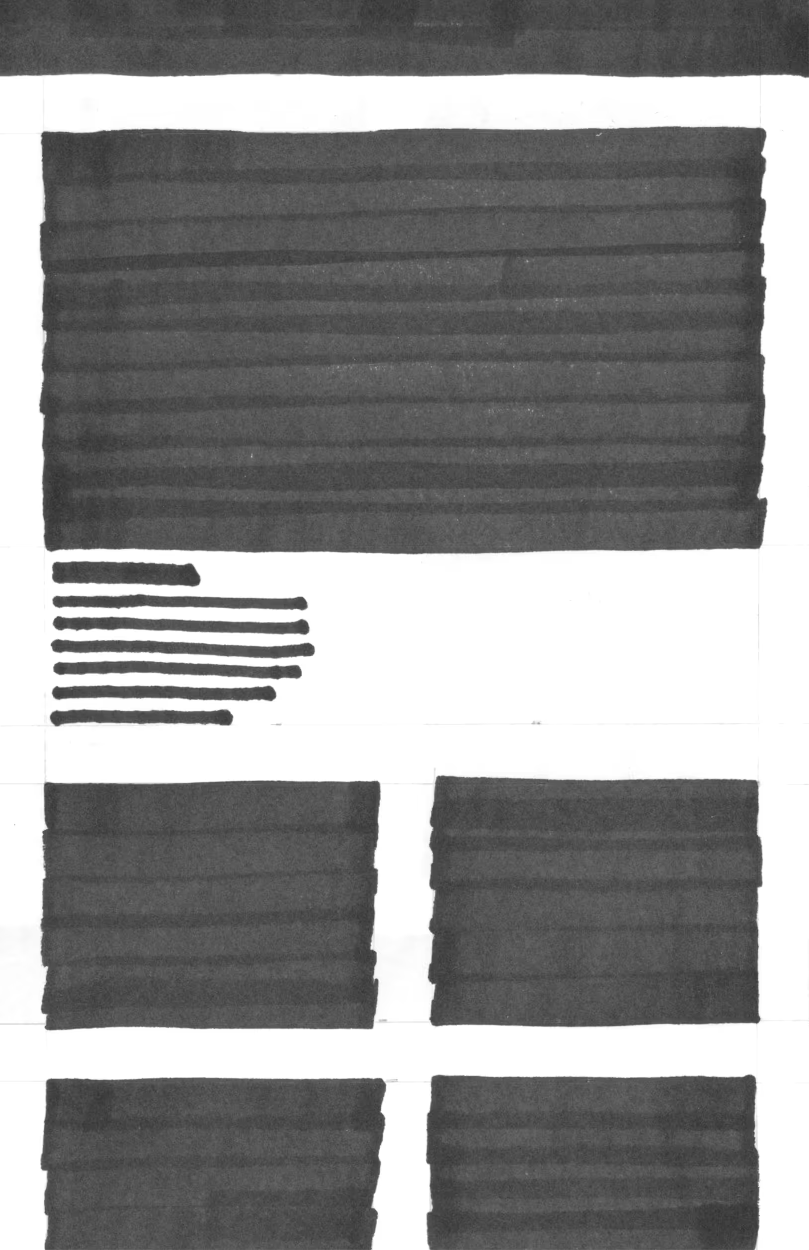
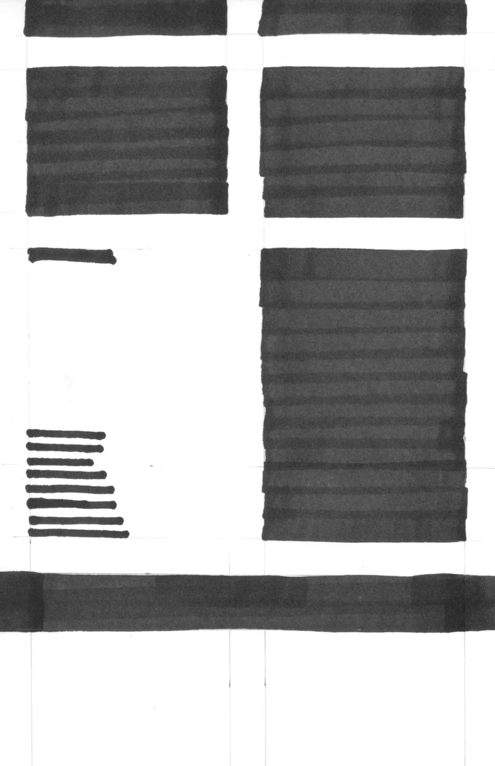
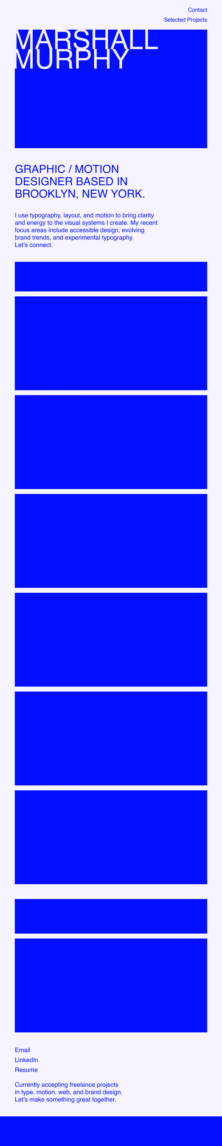
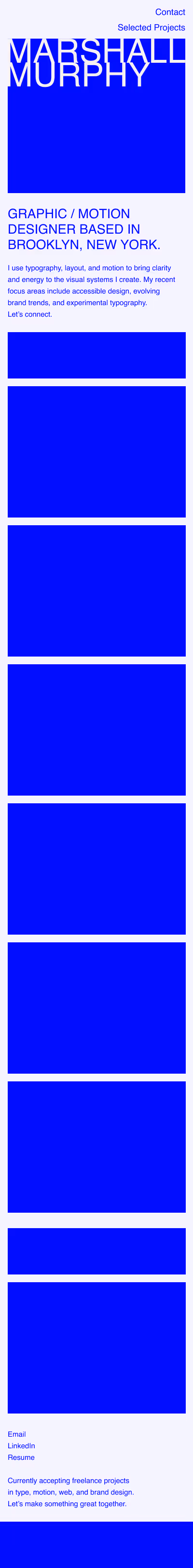
This page documents the build of this website, starting in Figma and evolving into a system with motion and interactivity. Below are the final wireframes, used to lock padding, spacing, and color choices before the Webflow build. They contain previous drafts, but the desktop layout ultimately informs the other breakpoints.
This page documents the build of this website, starting in Figma and evolving into a system with motion and interactivity. Below are the final wireframes, used to lock padding, spacing, and color choices before the Webflow build. They contain previous drafts, but the desktop layout ultimately informs the other breakpoints.
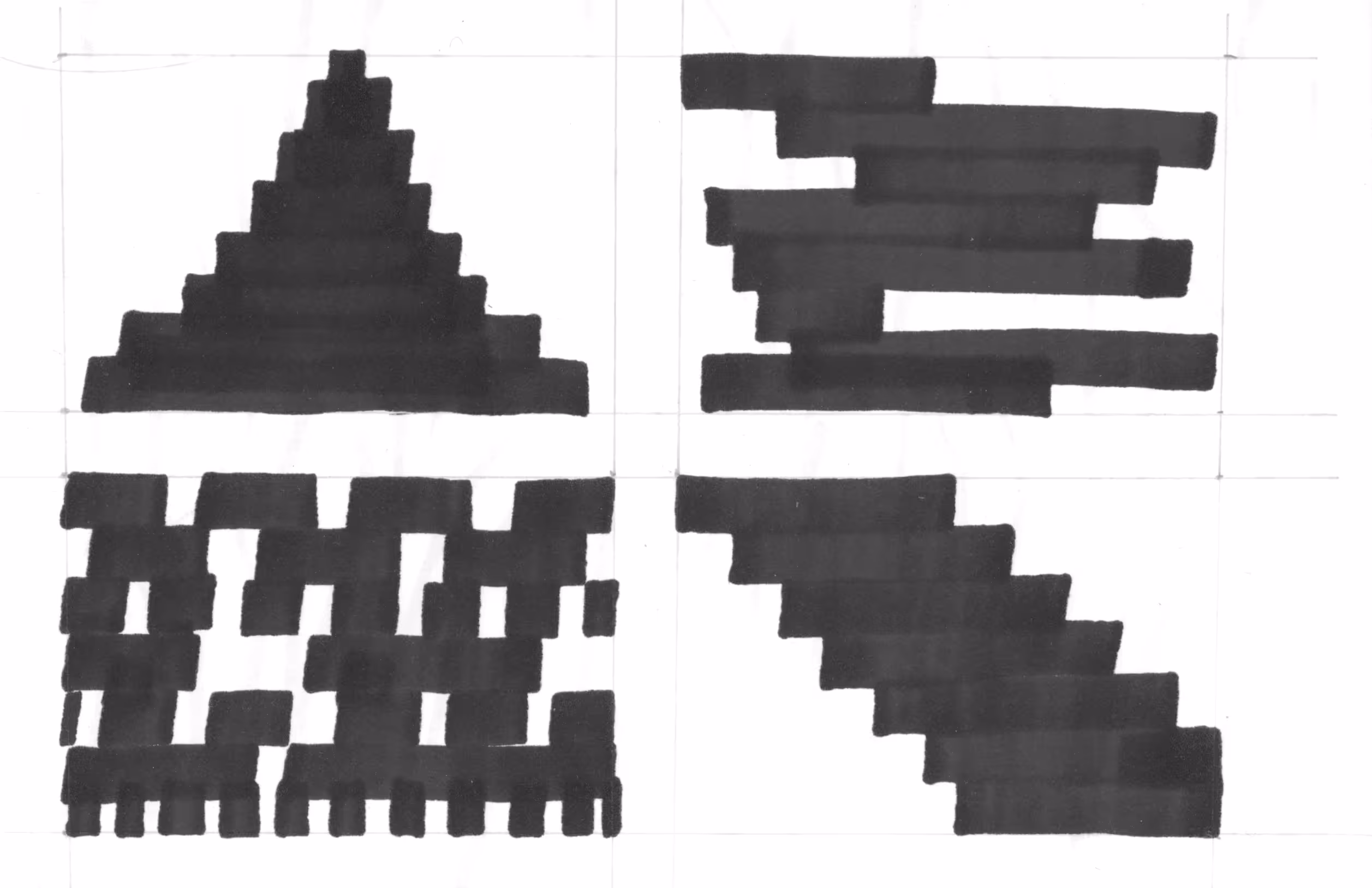
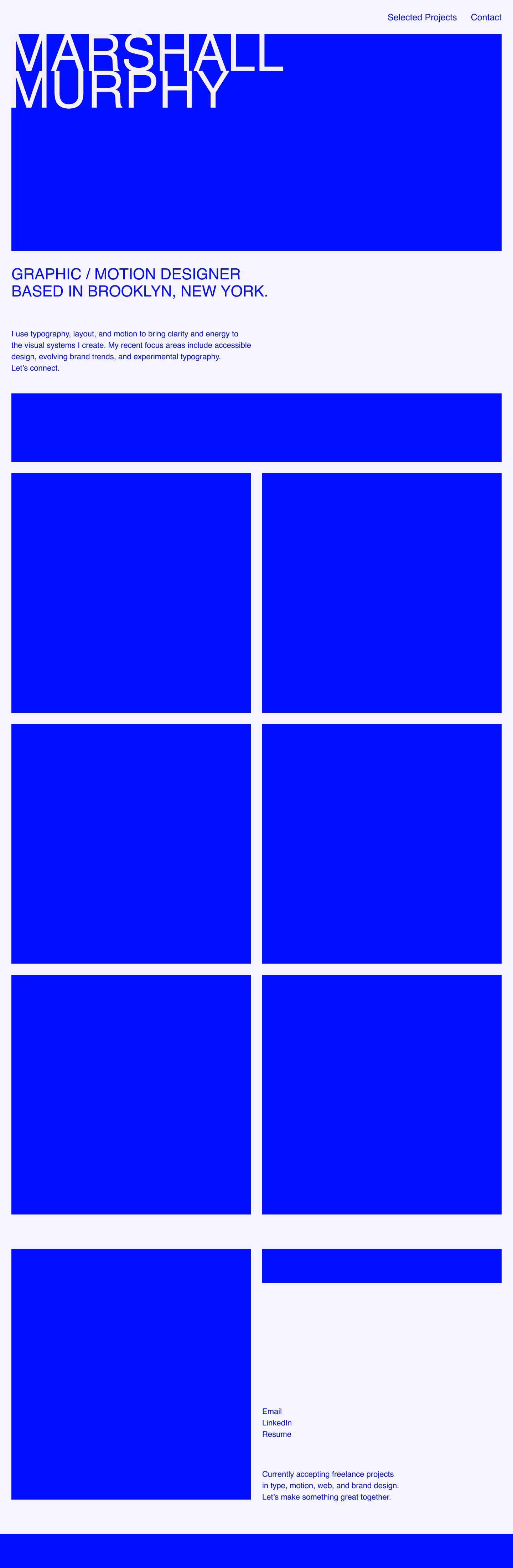
The hero animation anchors the site’s design. This motif later informs the cursor shape
as well as the multiple header reveals on the homepage.
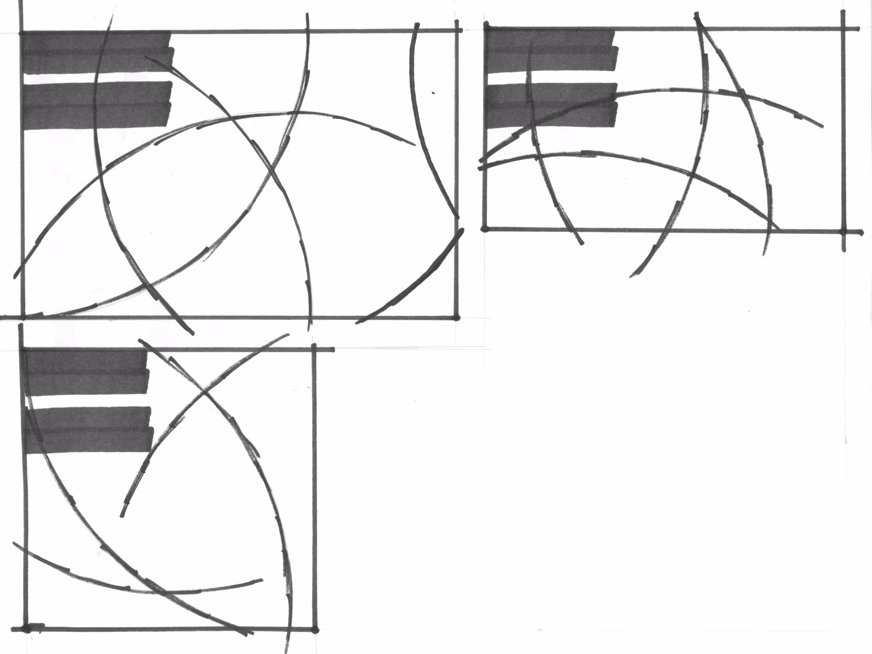
The squiggles offset the hero’s rigid geometry, injecting energy and a bit of irregularity.
Additionally, the cursor takes the opposite color of whatever is under it to ensure that it never gets lost on the page.
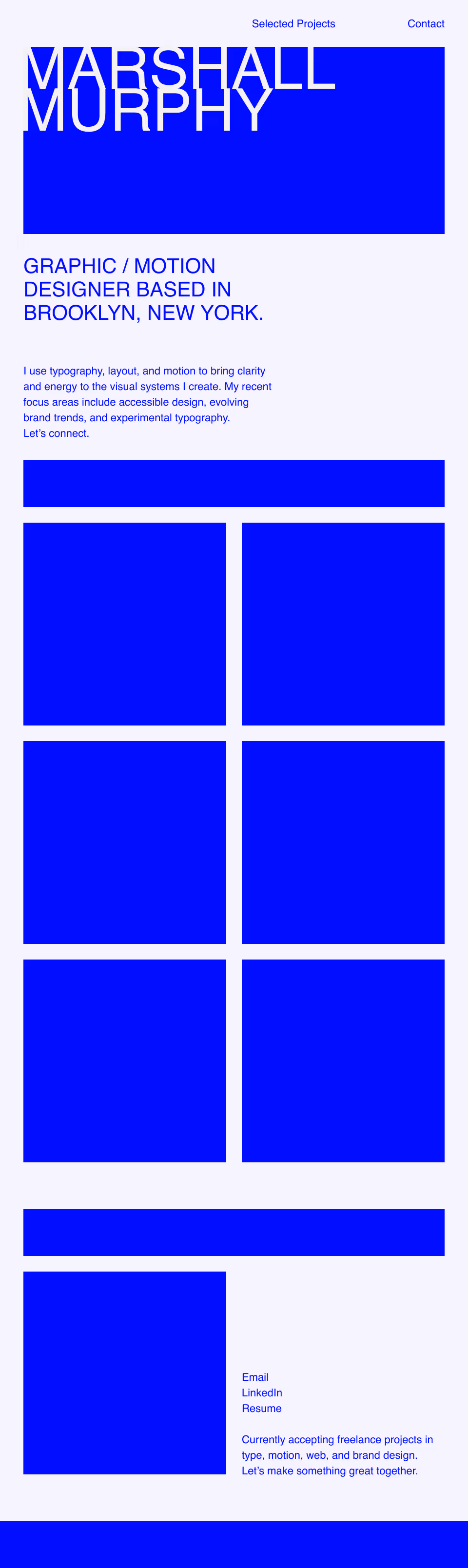
The project pages below mirror the homepage, so the build-out was quick. In Webflow the headlines felt busy, so I used the homepage-style cursor titles and removed the animations to keep the work front and center.